Canvas Accessibility
USING THIS PAGE
Canvas is a sophisticated tool for creating and presenting instructional content, so we need to think about how students see the information, how they will use it, if they can understand it, and how they interact with it.
The sections below cover using the built-in accessibility checkers, what to check for when formatting text in Canvas, and how accessibility is considered in organization and design.
You can find the complete Canvas accessibility standards guide here.
-
Using LMS Accessibility Checkers
When you create content in Canvas, you'll mainly use the 'Rich Content Editor' (RCE) which includes the toolbar above the text entry areas with different word processing features.
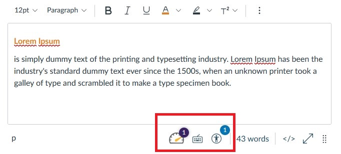
COCC's Canvas includes two built-in accessibility checkers: one that is part of Canvas itself and another that comes from our integrated accessibility tool, Panorama.
Both checkers work the same way by finding issues in content you've already created and as you edit or make new material. You can use either one, depending on your preference.
-
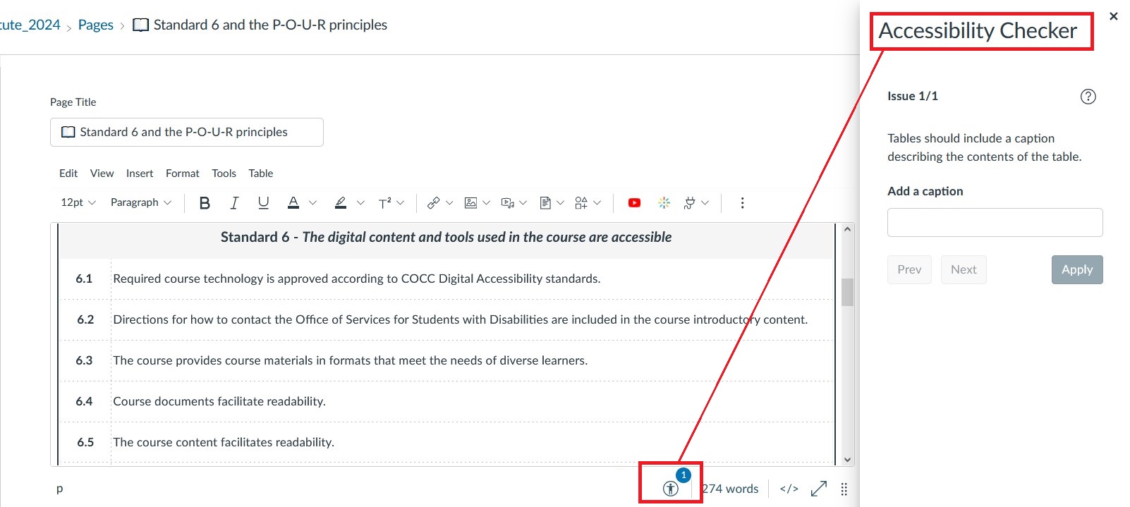
Canvas Accessibility Checker
Launch the Canvas checker through the icon at the bottom of the RCE when editing text content in Canvas.
Canvas Accessibility Checker Guide
-
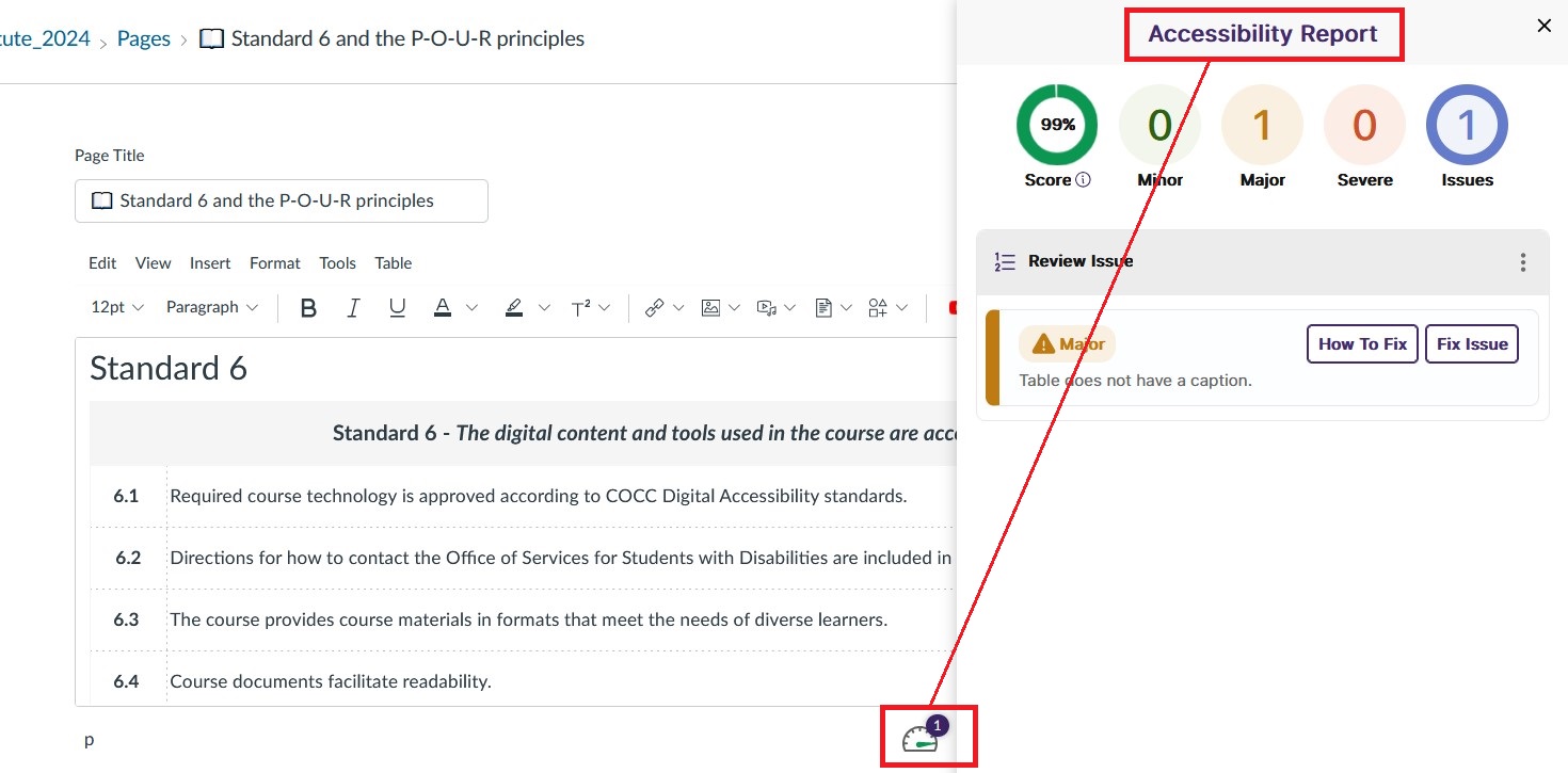
Panorama Accessibility Checker
Launch the Panorama checker through the gauge icon at the bottom of the RCE when editing text content in Canvas.
Other Panorama Guides:
-
-
Formatting Text Content
Below are guides for applying specific Digital Accessibility standards in Canvas.
This 10 minute overview video "How Do I Make a Canvas Page Accessible" demonstrates various accessibility features you might come across when creating content in Canvas.
-
Applying Heading styles
What to look for:
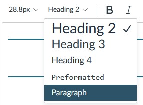
- In Canvas, the Page or Item Title is treated as Heading 1, while content headings
begin with Heading 2.
- Organize headings in order and avoid skipping levels.
-
- (H3 only after using H2, etc.)
-
- "Paragraph" refers to regular text without any headings and is the default text style.
- Break up the page content into smaller sections for better readability.
How to apply Headings in Canvas:
- Video: Canvas Accessibility: Headers
- Text Guide: Modifying Text Styles in the Rich Content Editor
- In Canvas, the Page or Item Title is treated as Heading 1, while content headings
begin with Heading 2.
-
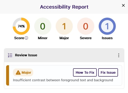
Colors have sufficient contrast and are used appropriately.
What to look for:
- Don’t rely on color alone to indicate actions, responses, or specific designations.
- For example, avoid using colored text or highlighting as the only way to emphasize information.
- Underlining and use of blue text should be only be used for hyperlinks.
How to check colors for sufficient contrast:
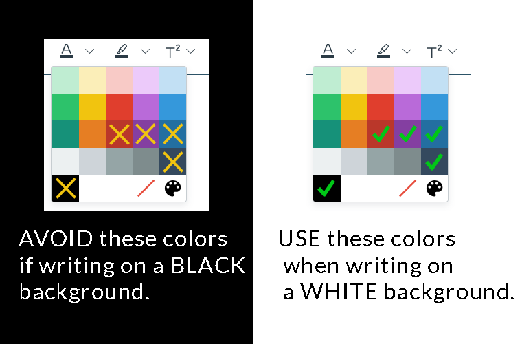
- If you're using the default Canvas color palette, use black, dark orange(#ba372a), dark purple (#843fa1), or dark blue (#34495e) for any text on a white background.
- Use a tool like the WebAIM color checker or Color Contrast Analyzer to check for contrast (with a minimum ratio of 4.5:1)
- Keep an eye on the Accessibility Checkers—they will notify you if the text in the Rich Content Editor has insufficient contrast.
- Don’t rely on color alone to indicate actions, responses, or specific designations.
-
Images have appropriate alt text
Alt text should be short and explain the purpose of an image; it isn’t necessary if the information is already included in the document text.
What to look for:
- For images that contain text, include a text-based equivalent.
- Decorative images should be labeled as such.

- If I remove this image from the document, what text would I add instead?
- How would I explain the purpose and function of the image to someone over the phone?
How to add alt text to images:
-
Course and External links self-describe
A "self-describing link" is one where the purpose of the link can be understood just from the link text. Avoid using unnecessary phrases like "click here" or "more" as link text in most cases.
In most cases, the proper link text is probably already in your content, and it just needs to be emphasized as the link.
For example:
- Self-describing: Learning how to write proper link text can be confusing, but you can learn more by visiting Oregon State University's guide to descriptive links.
- NOT-describing: Learning how to write proper link text can be confusing, but to learn more, click here.
Self-describing links are crucial for screen readers and help all users understand the purpose and context of the information presented.
Working with links in Canvas:
In Canvas, you can use the Rich Content Editor (RCE) to link to other course elements and external URLs.
- Text Guide: Creating hyperlinks to external URLs in the RCE
- Text Guide: Linking to documents in the RCE
- Text & Video: Creating links to course, group, and user files in the RCE
- Text & Video: Editing exiting links in the RCE
-
Accessible Tables and Lists
Tables
What to look for:
Avoid using tables to organize or structure information; numbered or bulleted lists and paragraphs with Headings are generally more accessible.
It might be tempting to use an 'invisible' table in Canvas to arrange content on a page, but avoid this! If you have a specific layout in mind, please reach out to eLearning for help with finding or building an accessible version.
How to build accessible tables in Canvas:
- Text Guide: Table Accessibility in Canvas
- Text Guide: Editing Table Properties in Canvas
Lists
Lists can be a more accessible alternative to simple tables and help make text content easier to read for all users.
- Use the RCE list tool to format your lists correctly; avoid using the number keys and spacebar
to create them.
- Text Guide: Formatting lists in Canvas
- Consider the content: the two most common types are ordered and unordered.
- Use ordered lists (numbers or alphabetical sequences) when the order of the items is important
- Use unordered lists (bullets or dashes) when the order doesn't matter.
-
-
Accessibility Principles in Canvas Design
One of the WCAG's guiding principles for digital accessibility is that content needs to be Understandable - it should support learner's understanding through consistent and predictable design.
This section will guide you through how to address this component of Digital Accessibility when structuring content in Canvas.
-
Reducing cognitive load
What is cognitive load?
Cognitive load refers to the use of working memory that is not related to learning content. In this case, it describes the mental effort required to navigate and understand content presented online.
In simple terms, it’s about how much effort it takes to figure out how to navigate a specific website.
When designing courses for students, our goal is to be intentional in our choices to reduce cognitive load as much as possible.
How to do this in Canvas:
- Make things very clear to students.
- Ensure that students know how to get started, navigate the course, where grading happens, and what they can expect from you.
- Avoid unnecessary elements.
- Focus on information, visuals, and additional materials that support the unit objectives so students can easily identify what’s truly important.
- Use common design patterns.
- Whatever naming convention or organizational methods you use, keep them consistent and logical.
- Eliminate unnecessary tasks.
- If you’re unsure about what needs to be included, refer back to the objectives and remove any content that doesn't help students master those goals.
- Reduce clicks and minimize distractions by building content directly in the LMS when
possible and embedding external content instead of linking to it.
- Text and Video: Embedding content in Canvas
- Make readability a priority.
- Readability is always more important than aesthetics.
- Simple black text on a white background will never look dated or perform poorly.
- Use Headings and break information into smaller sections with paragraphs, line breaks,
and lists.
- Text Guide: How 'Chunking' Information Helps Cognitive Load
 Introduce students to the Panorama Web Accessibility Tool, which allows students to customize the text display in Canvas and access other web-reading
tools.
Introduce students to the Panorama Web Accessibility Tool, which allows students to customize the text display in Canvas and access other web-reading
tools.
- Readability is always more important than aesthetics.
- Make things very clear to students.
-
Navigation and labeling is consistent
Students should not need to make major personal adjustments to easily perceive and navigate the LMS.
How to do this in Canvas:
- Use a Getting Started page
- Introduce students to the course and guide them on how to navigate the content.
- Here's a simple Getting Started Page template for COCC.
- Introduce students to the course and guide them on how to navigate the content.
- Be consistent with naming conventions
- Keep your naming conventions for Modules, Pages, and other content items uniform.
- Utilize Course Links and ensure links self-describe.
- Text Guide: Creating Course Links in Canvas
- Separate reference material
- Keep general resources that aren't specific to a weekly module in their own space.
- Hide unused menu items
- Remove anything students won't use, or that you only want them to encounter as they
progress through a module.
- Text Guide: Managing your Course Menu
- Remove anything students won't use, or that you only want them to encounter as they
progress through a module.
- Use a Getting Started page
-
Content supports diverse learners
Students engage with instructional content in various ways, sometimes differently than instructors intend.
Canvas content is often accessed via mobile devices, which can change how content appears and how easily students can interact with it.
How to do this in Canvas:
- Build content natively
- Whenever possible, create content directly in Canvas so students don’t have to download files to view it.
- Encourage students to use Panorama
- Panorama provides access to alternative formats like .mp3 and .EPUB at the click of a button.
- Share files in common formats
- Use formats are either system-agnostic (like PDFs) or MS Office, which are free to students.
- Upload low-bandwidth alternatives
- Provide lighter versions of "heavy" files (e.g., offer both the original PPT and a PDF version).
- Use Student View to review your course
- Open your course on a phone or tablet to see how it appears and functions in a different environment.
- Build content natively
-
-
Media and External Tools
This category includes audio and video content, as well as other digital course materials created outside of COCC.
For audio and video accessibility, it's important to present content in a way that allows students to interact with it without needing special tools. This means including closed captions or transcripts and ensuring that the platform lets users play and pause the content freely.
The three most common multimedia hosts used at COCC are Kaltura, Youtube, and Zoom.
Expand the menu below to to learn how to meet accessibility standards with each tool, and visit our Video and Media for Instructors page for more details on when to use each option.
- Audio and Video content have accurate closed captions or transcripts.
Zoom, YouTube, and Kaltura all offer auto-caption functionality, but most will require some editing to ensure full accuracy.
Each platform allows you to make small adjustments to the captions. (You must be the video owner to make these edits.)
Video Tutorials:
Text Guides:
Captioning Services
Did you know COCC has video captioners to help manage larger or more complex captioning projects?
Note: Your department may be billed for using this service. Please direct captioning questions to Erin Trimble.
- External tools can be fluently used on multiple device types.
If your course requires students to use specific tools or software, these should be tested for compatibility across different devices and operating systems.
Software
If a tool can only be used in certain environments, this should be clearly communicated to students in the syllabus.
You can find supported platforms and device types for commonly used COCC-supported software in the Academic Tech Catalog.
Test it!
Most digital course materials (like textbooks and publisher content) are accessed through Canvas, but that doesn’t guarantee that the external site or platform will work well on all devices.
Try accessing your content in different ways. If you encounter any major issues, be upfront with your students about the technology they will need to succeed without struggling.
-
- Audio and Video content have accurate closed captions or transcripts.