Microsoft PowerPoint
USING THIS PAGE
Expand each section below to learn the important accessibility elements to check for in this software, and how to use these standards in your documents.
All Microsoft Office products come with built-in accessibility tools that help users evaluate how accessible their documents are.
Here is Microsoft's guide for improving document accessibility with the Microsoft Accessibility Checker.
For more on PowerPoint specifically, visit the Microsoft Support page making your PowerPoint presentations accessible to people with disabilities.
-
Each slide has a unique title
What to look for:
- Every slide should have a unique Title.
- Titles serve the same navigational function as Headings in PPT presentations.
- If you convert a PPT to PDF, Titles become Headings in the new document.
- Even if your topic covers multiple slides, each title should still be different. You can add something like " - 2" to keep things organized while making sure it's accessible.
- Only use the "Title Slide" layout for your first slide.
- Use the Layouts tab in the Ribbon to choose slide layouts with the Title included.
 Other PowerPoint features rely on Titles to work correctly. Design Ideas, Apply Layout,
Insert Hyperlink and Reset Slide work better when slides have titles.
Other PowerPoint features rely on Titles to work correctly. Design Ideas, Apply Layout,
Insert Hyperlink and Reset Slide work better when slides have titles. How to work with Slide Titles in PowerPoint
- Text Guide: Title a Slide
- Text Guide: What is a Slide Layout?
- Every slide should have a unique Title.
-
Colors have sufficient contrast and are not used exclusively to convey information
What to look for:
- Don’t rely on color alone to indicate actions, responses, or specific designations.
- For example, avoid using colored text or highlighting as the only way to emphasize information.
- Underlining and use of blue text should be reserved for hyperlinks only.
How to check colors for appropriate contrast:
- Use a tool like the WebAIM color checker or Color Contrast Analyzer to check for contrast (with a minimum ratio of 4.5:1)
- Stick to using these "safe" colors in the Standard MS Office Theme:
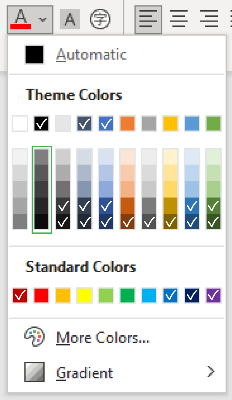 Hex Codes for safe colors:
Blues: 44546a, 4472c4, 323f4f, 2f5496, 1f3864, 0070c0, 002060, 2e75b5, 1e4e79, 222a35
Grays: 595959, 3f3f3f, 262626, 0c0c0c, 171616, 3a3838
Greens: 538135, 375623
Reds/Oranges: c00000, 833c0b, 7f6000
- Don’t rely on color alone to indicate actions, responses, or specific designations.
-
Images contain meaningful alt text
What to look for:
- Alt text should be short but meaningful and explain the purpose of an image.
- For images of text, include a text-based equivalent.
- If the information is already included in the document text, mark the image as decorative.
- Decorative images should be labeled as such, not skipped.

When writing alt text, try asking yourself:
- If I remove this image from the document, what text would I add instead?
- How would I explain the purpose and function of the image to someone over the phone?
How to add alt text to different PowerPoint elements:
- Video: Improving Accessibility with Alt Text
- Video and Text: Improving Image Accessibility in PowerPoint
- Text Guide: Everything you need to know to write effective alt text
- Text Guide: Add alt text to SmartArt graphics
-
Audio and video elements are captioned
Media from outside sources
In most cases, multimedia elements in PowerPoint are linked or embedded from other sources, so you should handle captioning there.
Check out our closed captioning guide (Intranet link) for more details on how to do that.
Self-hosted Media
If you’re including video content directly—like a recording of yourself or other screen recordings—you can add captions right in PowerPoint.
How to add closed captions to media in PowerPoint:
- Text Guide: Add Closed Captions to Media in PowerPoint
-
Text formatting and layout supports readability
Well-formatted slide text won’t slow down anyone’s reading speed, including people with low vision, reading disabilities, or those who are blind.
What to look for:
- Use standard sans-serif fonts like Arial, Aptos, or Calibri
- Make sure the body text is at least 18 points.
- Keep the number of lines under 10 and leave plenty of space between them.
- Check the reading order of each slide.
How to improve PowerPoint readability:
-
Links use meaningful text to ‘self-describe’
What to look for:
A "self-describing link" is one where the purpose of the link can be understood just from the link text. Avoid using unnecessary phrases like "click here" or "more" as link text in most cases.
For example:
- Self-describing: Learning how to write proper link text can be confusing, but you can learn more by visiting Oregon State University's guide to descriptive links.
- NOT-describing: Learning how to write proper link text can be confusing, but to learn more, click here.
Self-describing links are crucial for screen readers and help all users understand the purpose and context of the information presented.
In most cases, the proper link text is probably already in your content, and it just
needs to be emphasized as the link.
For example, if the title on the hyperlink's destination page gives an accurate summary of what’s on the page, use it for the hyperlink text.How to create accessible hyperlinks:
- Video and Text: Adding links to PowerPoint slides
- Text Guide: Link from one slide to another in PowerPoint
-
Tables and lists are accessible
Tables
Screen-readers can struggle with tables in PowerPoint, so try to present the information in another format if you can.
What to look for in an accessible table:
- Always include a Table Header.
- Avoid fixed width tables.
- If your table has hyperlinks, edit the link text so it makes sense and doesn’t cut off in the middle of a sentence.
- Use a simple table structure and specify column header information.
- Simple = predictable: avoid using merged or empty cells if you can.
How to make accessible tables:
- Video: Creating accessible tables in PowerPoint
- Text Guide: Adding Table Headers
- If setting a specific table width, use a percentage vs. fixed width
Lists
Lists can be a more accessible alternative to simple tables and help make text content easier to read for all users.
- Use the list tool to format your lists correctly; avoid using the number keys and spacebar to create them.
- Consider the content: the two most common types are ordered and unordered.
- Use ordered lists (numbers or alphabetical sequences) when the order of the items is important.
- Use unordered lists (bullets or dashes) when the order doesn't matter.
